AVANT LA LETTRE
An unknown, early smile ahead of
fancy typography
27,00 €
DESCRIPTION IN ENGLISH BELOW ↓

LE SURPRENANT CLIN D’ŒIL D’UN CARACTÈRE DEMEURÉ TOTALEMENT INCONNU, QUOIQUE PRÉCURSEUR DE LA TYPOGRAPHIE DE FANTAISIE.
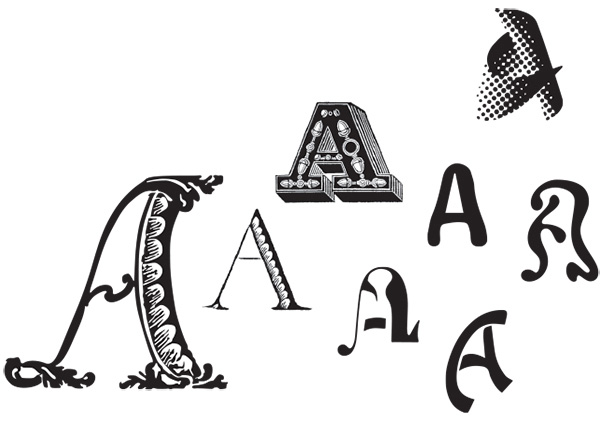
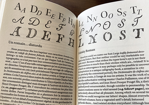
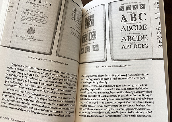
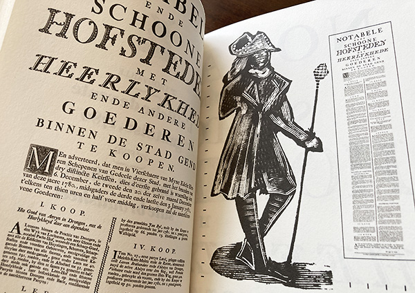
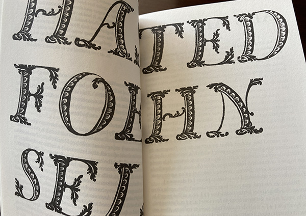
Un caractère resté ignoré jusqu’ici a refait surface au hasard de récentes ventes aux enchères, sur deux anciennes affiches. C’est un type un peu bizarre, en usage dans les Flandres au XVIIIe siècle, qu’on ne retrouve dans aucun spécimen ni aucune étude, alors qu’il peut être vu comme précurseur d’un bon nombre des audaces graphiques qui ont suivi. Ses formes, qui ne correspondaient à aucun des canons de son époque, donnent un aperçu inédit sur l’irruption de la fantaisie en typographie lorsque, pour répondre à l’essor de la publicité, cette profession jusque-là plutôt conformiste a bien voulu concéder à la liberté de création.
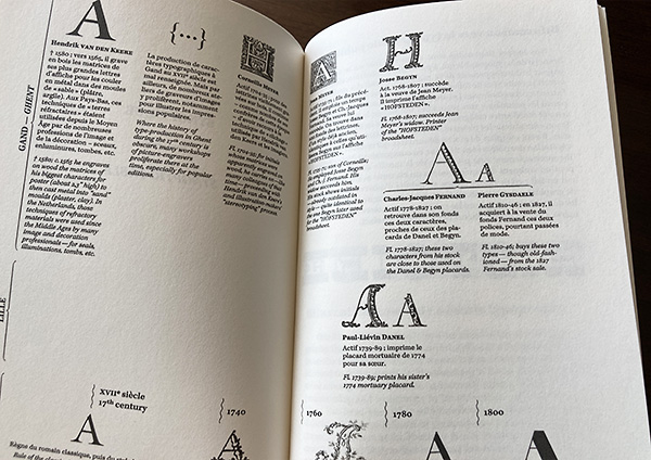
De nombreux exemples rares et caractéristiques sont reproduits dans ces pages, certains pour la première fois – scannés sur des originaux d’époque. Le spécialiste débrouillera ses connaissances sous un éclairage insolite et nouveau. L’amateur appréciera quant à lui ces étonnants phénomènes à la façon dont on lit un roman historique.
LIVRE
TIRAGE DE 180 EXEMPLAIRES
FABRICATION MODERNE (et non pas typographique)
TEXTE EN FRANÇAIS ET EN ANGLAIS
TIRAGE DE 180 EXEMPLAIRES
FABRICATION MODERNE (et non pas typographique)
TEXTE EN FRANÇAIS ET EN ANGLAIS
Auteur : Philippe Blanc
Année de publication : 2023
160 pages imprimées en noir sur rotative numérique à jet d’encre et 4 pages de couverture en offset en noir, tirage sur papiers bouffants Munken, format 12,5 x 21 cm, dos carré collé, non cousu.
ISBN 978–2‑9587511–1‑1
ISBN 978–2‑9587511–1‑1
A STUNNING DISCOVERY, THOUGH ON WELL-KNOWN FIELDS.
A typeface which had surprisingly remained ignored until now has recently resurfaced at auctions’ random, on two antique posters. It is a large, somewhat quirky 18th century character that was used in Flanders. It can’t be met in any specimen nor essay, although it may be considered predecessor in a lot of the graphic audacities that followed. While its design did not match any standard of the time, it allows to give evidence to the irruption of “fancy” faces in typography, when this hitherto conformist profession has been willing to concede to creative freedom, in order to meet the boom in advertising.
Numerous rare and characteristic samples are reproduced in these pages, some for the first time — scanned from originals. The type-specialist will improve his knowledge under unusual new lights. The amateur will appreciate those freaky trends like by reading a historical novel.
BOOK
A 180 COPIES RUN
MODERN MAKING (not letterpress)
TEXT IN ENGLISH AND FRENCH
Author: Philippe Blanc
Year of publication: 2023
160 pages printed in black on an ink-jet digital rotary press and 4 cover pages offset printed in black, on Munken uncoated bulky papers, format 4.9 x 8.2”, a hardback, pasted, not sewn.
ISBN 978–2‑9587511–1‑1
Voir aussi / You may also like:
